
Cũng như các dạng câu hỏi khác trong phần thi IELTS Writing task 1, Pie chart cũng có rất nhiều cách viết khác nhau. Trong bài viết ngày hôm nay, duhoctms.edu.vn sẽ chia sẻ đến các bạn chi tiết về cách viết Pie Chart, cùng tìm hiểu nhé!
1. Giới thiệu về biểu đồ Pie Chart
Pie Chart là một dạng biểu đồ có hình tròn, được chia thành các lát cắt nhằm minh họa theo tỷ lệ phần trăm. Trong biểu đồ Pie Chart, độ dài của cung tỷ lệ thuận với giá trị phần trăm mà nó cần biểu thị. Phần cung càng lớn thì giá trị biểu thị sẽ càng lớn. Trong Writing Task 1, các bạn có thể gặp 2 loại biểu đồ Pie Chart chính như sau:
Loại thứ nhất là đề bài chỉ cho một biểu đồ tròn duy nhất (Loại này ít gặp trong bài thi).
Loại thứ hai thì thường gặp hơn – đề bài có sự biến đổi về theo thời gian. Loại này thường biểu thị sự lên xuống về mặt giá trị theo thời gian của các hạng mục được biểu thị. Loại này khá phức tạp và khó để xử lý hơn nhiều so với loại thứ nhất.
2. Đặc điểm nổi bật của biểu đồ Pie chart
- Hầu hết các biểu đồ Pie chart thường có sự so sánh phần trăm hay tỉ lệ giữa các đối tượng. Đơn vị được sử dụng trong biểu đồ pie chart là percent (%)
- Khi đề có từ 2 pie charts trở lên, có thể có sự xuất hiện của xu hướng thay đổi như tăng hay giảm về phần trăm của những đối tượng được so sánh.
- Có một số Pie chart không có sự thay đổi theo về mặt thời gian, mà nó so sánh số liệu ở các nhóm tuổi, quốc gia …
- Các THÌ được sử dụng để miêu tả biểu đồ Pie chart sẽ giống với biểu đồ Line Graph: Thời gian trong quá khứ thì sử dụng thì quá khứ đơn, thời gian ở hiện tại thì mô tả bằng thì hiện tại đơn, thời gian từ quá khứ đến tương lai thì có thể sử dụng hiện tại đơn hoặc hiện tại hoàn thành
3. Cách viết Pie Chart – IELTS Writing Task 1
Để viết một bài IELTS Writing task 1, các bạn cần hoàn chỉnh 4 bước:
- Bước 1: Phân tích đề
- Bước 2: Paraphrase đề bài – viết phần Introduction
- Bước 3: Xác định ý và viết Overview
- Bước 4: Lựa chọn, nhóm thông tin và viết 2 đoạn Detail
3.1. Phân tích đề và lên dàn ý
Phân tích đề luôn được đánh giá là bước đầu tiên và quan trọng nhất khi làm bài Writing, đặc biệt là IELTS Writing Task 1. Với dạng bài Pie Chart, khi phân tích đề, các bạn cần lưu ý các điều sau:
- Có bao nhiêu biểu đồ tròn trong đề? Các biểu đồ biểu thị cho hạng mục gì?
- Biểu đồ có sự thay đổi về mặt thời gian không? Địa điểm biểu đồ biểu thị là ở đâu?
- Đơn vị của biểu đồ là gì?
- Sau khi đã xác định các yếu tố cơ bản của biểu đồ, các bạn tiếp tục chú ý đến các chi tiết: Có sự tăng, giảm về giá trị của các hạng mục? Giá trị lớn nhất, nhỏ nhất. Các điểm đặc biệt trong biểu đồ (các giá trị bằng nhau, các giá trị gấp đôi, …)
Biểu đồ có sự biến đổi về thời gian
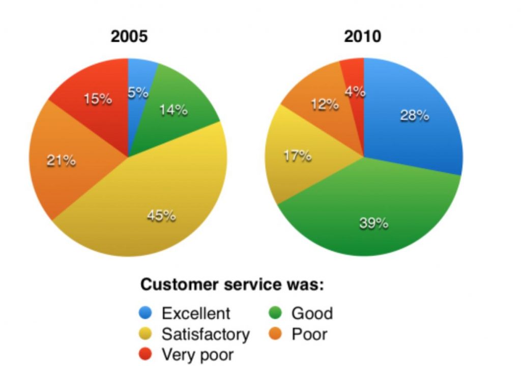
“The charts below show the results of a questionnaire that asked visitors to the Parkway Hotel how they rated the hotel’s customer service. The same questionnaire was given to 100 guests in the years 2005 and 2010.
- Có 2 biểu đồ trong đề bài. Cả 2 biểu đồ đều thể hiện sự đánh giá của khách hàng về các dịch vụ nhà hàng.
- Biểu đồ có sự thay đổi về mặt thời gian. Địa điểm được biểu thị cụ thể tại khách sạn Parkway.
- Đơn vị là %
Các điểm nổi bật:
- Năm 2005: đa phần các khách hàng cảm thấy dịch vụ khách sạn thỏa mãn (satisfactory) hoặc dịch vụ chưa thoả mãn (poor);
- Năm 2010: đa phần các khách hàng cảm thấy dịch vụ tốt (good) hoặc xuất sắc (excellent)
- Phần trăm khách hàng cảm thấy tốt (good) và xuất sắc (excellent) tăng qua 5 năm.
Biểu đồ không có sự biến đổi theo thời gian
“The chart below shows the results of a survey of people who visited four types of tourist attractions in Britain in the year 1999.”
- Đề bài có 1 biểu đồ chính và 1 biểu đồ phụ. Biểu đồ chính đề cập đến lượng khách du lịch tới các khu giải trí, biểu đồ phụ biểu thị lượng khách du lịch đến các Theme Parks.
- Biểu đồ không có sự biến đổi về thời gian, địa điểm là tại Anh.
- Đơn vị là %.
Các điểm nổi bật:
- Theme Parks và Museums & Galleries thu hút được nhiều khách du lịch nhất, trong khi đó Wildlife Parks and Zoos có lượng khách hàng ít nhất
- Blackpool Pleasure Beach là Theme Parks thu hút được rất nhiều khách du lịch nhất
3.2. Cấu trúc bài viết pie chart
Sau khi đã phân tích đề một cách kỹ càng, các bạn có thể chuyển sang bước lập dàn ý cho bài viết. Cấu trúc bài viết Pie Chart cũng tương tự với các dạng khác, bao gồm 3 phần chính như sau: Introduction, Overview và Body.
Về phần Introduction, các bạn chỉ đơn giản paraphrase lại đề bài.
Với Overview, các bạn luôn luôn chú trọng đầu tiên là xu hướng chính trong biểu đồ. Nếu biểu đồ không có xu hướng, bạn có thể nêu ra các giá trị lớn nhất hoặc giá trị nhỏ nhất.
Về phần Body, nếu biểu đồ chỉ có một Pie Chart duy nhất, các bạn tiến hành sắp xếp và miêu tả thông tin từ lớn nhất đến nhỏ nhất. Nếu trường hợp có 2 hay nhiều biểu đồ, các bạn có thể làm theo các bước sau đây:
- Đánh dấu những hạng mục được thể hiện trong biểu đồ theo xu hướng bằng mũi tiên lên, xuống và không thay đổi
- Chia các hạng mục theo từng nhóm cụ thể nhằm so sánh và đối chiếu
- Miêu tả thông tin thành 2 đoạn thân bài một cách mạch lạc và logic. Lưu ý các điểm đặc biệt của biểu đồ.
3.3. Viết bài pie chart
Sau khi đã có được dàn ý cho bài, các bạn có thể bắt tay vào việc viết bài. Tương tự với các dạng bài writing khác, bạn chỉ nên dành khoảng 15 phút để viết bài.
Ví dụ về biểu đồ có sự biến đổi về mặt thời gian
Introduction
Paraphrase lại đề bài: bạn có thể paraphrase theo một trong hai cách: word by word hoặc new structure. Tuy nhiên, cách word by word đơn giản và phổ biến hơn.
Ví dụ
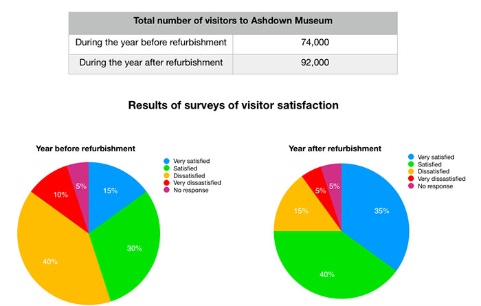
The charts below show the results of a questionnaire that asked visitors to the Parkway Hotel how they rated the hotel’s customer service = “The pie charts compare visitors’ responses to a survey about customer service at the Parkway Hotel in 2005 and in 2010.”
Overview
- “It is clear that overall customer satisfaction increased considerably from 2005 to 2010.”
Sự hài lòng của khách hàng về dịch vụ khách sạn có xu hướng tăng từ năm 2005 đến năm 2010.
- “While most hotel guests rated customer service as satisfactory or poor in 2005, a clear majority described the hotel’s service as good or excellent in 2010.”
Năm 2005: đa phần khách hàng cảm thấy dịch vụ khách sạn thỏa mãn (satisfactory) hoặc dịch vụ kém (poor); Năm 2010: đa phần khách hàng cảm thấy tốt (good) hoặc xuất sắc (excellent)
Body
- “Looking at the positive responses first, in 2005 only 5% of the hotel’s visitors rated its customer service as excellent, but this figure rose to 28% in 2010.”
Tỷ lệ khách hàng đánh giá xuất sắc (excellent) chỉ khoảng 5% vào năm 2005, tăng lên 28% vào năm 2010.
- “Furthermore, while only 14% of guests described customer service in the hotel as good in 2005, almost three times as many people gave this rating five years later.”
Tỷ lệ khách hàng đánh giá tốt (good) là 14% vào năm 2005 đã tăng gấp 3 lần vào năm 2010.
- “With regard to negative feedback, the proportion of guests who considered the hotel’s customer service to be poor fell from 21% in 2005 to only 12% in 2010.”
Tỷ lệ khách hàng đánh giá kém (poor) giảm từ 21% từ năm 2005 xuống 12% vào năm 2010.
- “Similarly, the proportion of people who thought customer service was very poor dropped from 15% to only 4% over the 5-year period.”
Tỷ lệ khách hàng đánh giá rất kém (very poor) giảm từ 15% xuống 4% trong vòng 5 năm.
3.4. Kiểm tra lại bài viết
Sau khi đã hoàn thành bài viết, các bạn nên dành ra khoảng 2 – 3 phút để kiểm tra lại. Chú ý về phần chính tả, ngữ pháp, các động từ được chia đúng hay chưa.
Ngoài ra, trong cách viết Pie Chart, các bạn nên chú ý vào các số liệu mình liệt kê trong bài viết. Đặc biệt với trường hợp có nhiều hơn 2 biểu đồ, các bạn dễ dàng liệt kê nhầm số liệu. Kiểm tra lại bài viết là bước quan trọng và cần thiết trong cách viết IELTS Writing Task 1 Pie Chart
4. Từ vựng và cấu trúc trong cách viết Pie Chart Writing Task 1
Miêu tả biểu đồ Pie Chart cần một số lượng lớn từ vựng, đặc biệt từ vựng và cấu trúc miêu tả phần trăm.
4.1. Từ vựng diễn tả chiếm số lượng/ phần trăm
- To have
- be
- take
- take up
- account for
- constitute
- occupy
- amount to
- take up
4.2. Từ vựng về phần trăm
| Phần trăm | Từ vựng |
| 80% | four-fifths |
| 75% | three-quarters |
| 70% | even in ten |
| 65% | two-thirds |
| 60% | three-fifths |
| 55% | more than half |
| 50% | half |
| 45% | more than two fifths |
| 40% | two-fifths |
| 35% | more than a third |
| 30% | less than a third |
| 25% | a quarter |
| 20% | a fifth |
| 15% | less than a fifth |
| 10% | one in ten |
| 5% | one in twenty |
| 77% | just over three quarters approximately three quarters |
| 49% | just under a half nearly a half |
| 32% | almost a third |
| 75% – 85% | a very large majority |
| 65% – 75% | a significant proportion |
| 10% – 15% | a minority |
| 5% | a very small number |
4.3. Từ vựng để diễn tả nhóm tuổi
- The 10 – 20 age group
- The group of 10 – 20 – years–old
- The group of/ at/ aged 10 – 20
- People at/ of/ aged 10 – 20 years old
- The 10 – 20-year-old group
4.4. Cấu trúc miêu tả Pie Chart – IELTS Writing Task 1
Cấu trúc miêu tả 1 phần của biểu đồ
- Cấu trúc 1:
| The highest/ The smallest/ The lowest/ The largest/ The greatest | percen/ tage/ proportion/ quantity/ number | of + N | to be/V |
Ví dụ: “The highest number of animals was in Australia”.
- N + the most/ least + Adj + N
Ví dụ: “Brazil was the least attractive country among all nations”.
- There + be + adj + N + in + N
Ví dụ: There was an increase in the proportion of animals in Brazil.
- N + V + Adv
Ví dụ: The proportion of animals in Brazil dropped significantly in 1990.
Cấu trúc miêu tả 2 phần biểu đồ
- As many/ Twice as many/ Three times as many/ Not as many + N + to be/ V + as
Ví dụ: “In 1990, twice as many red motorbikes were produced in Brazil as in the UK.”
- More/ Far more/ Much More… + N + to be/ V + than
Ví dụ: “In 1990, much more red motorbikes were produced in Brazil than in the UK.”
- As/ Whereas/ While X verb, Y verb (at the same time):
Ví dụ: As the proportion of animals in Brazil dropped significantly, that in Poland increased.
- Clause, followed by + Noun Phrase
Ví dụ: There was a slight increase in the proportion of animals in Brazil in 1997, followed by a dramatic decrease after 10 years.
- Clause, prior to/before Verb-ing
Ví dụ: There was a slight increase in the proportion of animals in Brazil in 1997, before decreasing after 10 years.
- X verb, Verb-ing, (which verb)
Ví dụ: The percentage of mammal animals in Brazil increased to 30% in 1997, exceeding the proportion in Poland, which had only 12%.
- (Far/ Much/ Many/ Considerably/ Significantly/ Dramatically…) + more + N + to be/ V + than …
Ví dụ: Far more cars are produced in Brazil than in Austria.
- In comparison to/with X, which verb, Y verb
Ví dụ: In comparison with the percentage of animals in Brazil, which experienced a slight increase to 30,000 in 1997, the proportion in Korea dropped to 12,000 at this time.
5. Lưu ý trong cách viết Pie Chart
5.1. Sử dụng sai thì
Đây là lỗi sai khá phổ biến trong cách viết Writing Task 1 Pie Chart. Với Pie Chart, các bạn nên chú ý vào dạng đề bài có sự thay đổi về mặt thời gian. Đặc biệt với đề bài có đề cập đến thời gian trong tương lai, bạn hãy chú ý sử dụng các cấu trúc và động từ ở thì tương lai.
5.2. Liệt kê quá nhiều số liệu
Cho dù đề bài có đề cập đến sự thay đổi về thời gian hay không, các bạn cũng không nên đề cập đến tất cả số liệu trong biểu đồ.
Để tránh việc liệt kê quá nhiều dữ liệu, các bạn có thể tham khảo phần từ vựng trong bài viết, đặc biệt là các từ vựng được sử dụng nhằm thay thế các tỷ lệ phần trăm.
Ví dụ, 50% có thể thay bằng “half of” hay 77% sẽ được diễn đạt bằng cụm “just over three quarters”.

5.3. Không nên sử dụng từ vựng đa dạng
Đây cũng là một trong những lỗi sai thường gặp trong Task 1, đặc biệt đối với dạng đề Pie Chart. Nhiều bạn thí sinh chỉ đơn thuần liệu kê và phân tích số liệu nhưng lại quên không làm rõ các điểm nổi bật.
Bạn nên cố gắng sử dụng các trạng từ như “slightly, merely, significantly, dramatically, …” khi muốn so sánh các phần hơn kém với nhau. Ngoài ra, các bạn cũng nên sử dụng các từ nối để so sánh như “In contrast, Similarly, Likewise, …:” để bài viết của bạn trở nên mạch lạc hơn.
6. Tài liệu học IELTS Writing Task 1 Pie Chart
6.1. Tài liệu 15 Days’ Practice for IELTS Writing
Đây là cuốn tài liệu tổng kết tất cả các kỹ năng cần thiết trong bài thi Writing. Đặc biệt, cuốn sách được trình bày dưới dạng chia sẻ, cung cấp từng bước cần thiết trong cách viết bài. Phần biểu đồ Pie Chart nằm trong chương Day 4, bao gồm đề bài, cách phân tích đề, các lập dàn ý và các bài viết mẫu.
6.2. IELTS Exam Preparation
Đây là trang web ôn luyện Writing nói chung và Writing Task 1 nói riêng khá hiệu quả. Với mỗi dạng bài, các bạn đều có thể tìm thấy nhiều tài liệu, đề bài và lời giải cho từng đề. Nếu muốn ôn luyện riêng Pie Chart, các bạn có thể gõ tìm kiếm từ khóa Pie Chart.
6.3. IELTS Advantage Writing Skill
Cuốn sách này phù hợp đối với các bạn có mục tiêu 7.0 trong Writing. Phần Pie Chart và Writing Task 1 nằm ở phần sau của cuốn sách. Các bài tập được liệt kê giúp cải thiện kỹ năng xác định và phân tích đề của bạn.
7. IELTS Writing Task 1 Pie Chart Sample
7.1. IELTS Writing Task 1 Pie Chart Sample #01
Đề bài
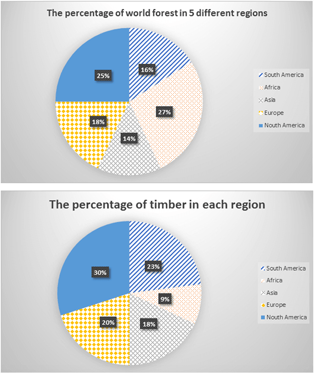
The charts below give information about the percentage of world forest and also the percentage of timber in five different regions.
Bài mẫu
The pie charts detail the distribution of global forest and also the percentage of timber in five different continents namely South America, Africa, Asia, Europe and North America. Overall, North America accounted for the highest proportions of both forest and timber production. It is also clear that Africa, despite having the largest forest cover among the five given continents, produced the smallest amount of timber.
Regarding the first pie chart, Africa constituted 27% of the total global forest, making it the most heavily forested region. North America had around 25%, and the forest cover rates of Europe, South America and Asia were a little bit less, with the figures amounting to 18%, 16% and 14% respectively.
Moving on to the second pie chart, North America produced the most timber at around 30%, which was followed by South America (23%), Europe (20%) and Asia (18%). Meanwhile, Africa’s timber production made up a negligible 9%, ranking last among the given regions.
7.2. IELTS Writing Task 1 Pie Chart Sample #02
Đề bài
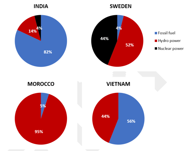
The charts show the sources of electricity produced in 4 countries between 2003 and 2008. Summarise the information by selecting and reporting the main features, and make comparisons where relevant.
Bài mẫu
The given pie charts detail information about the proportion of three different sources of electricity in four countries (India, Sweden, Morocco and Vietnam) from 2003 to 2008.
Overall, Vietnam and Morocco did not use any nuclear power for electricity production. It can also be seen that while fossil fuels were the largest source of electricity supply in Vietnam and India, they only occupied a relatively marginal proportion in Morocco and Sweden during the examined years.
In Vietnam, 56% of the total amount of electricity was produced from fossil fuels, while the figure for Morocco was only 5%. The rest of the electricity, in both nations, was produced solely from hydro power.
In India however, electricity from fossil fuels contributed to 82% of the entire quantity of electricity produced, which was also the highest figure for fossil fuel use among the four countries. Meanwhile, fossil fuels were only responsible for 4% of the total generated electricity in Sweden, with hydro power and nuclear power contributing 52% and 44% respectively.
7.3. IELTS Writing Task 1 Pie Chart Sample #03
Đề bài
Bài mẫu
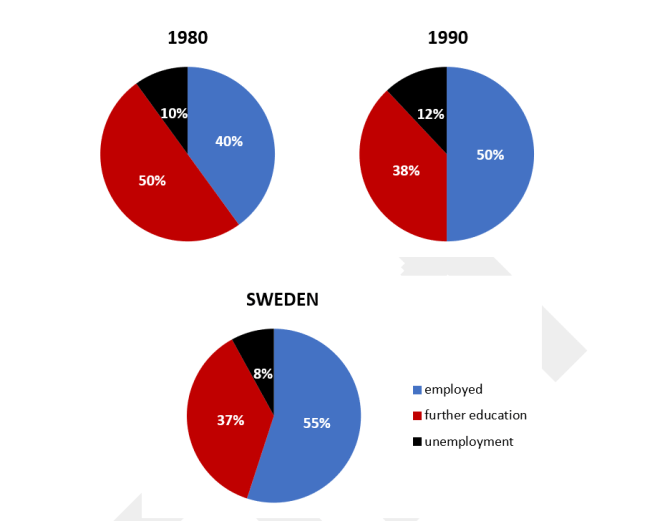
The given pie charts detail the proportion of Australian secondary school graduates who were unemployed, employed or pursuing further education, in 1980, 1990, and 2000.
Overall, from 1980 to 2000, the proportion of Australian students who were employed grew, while there was a decline in both the proportion of those pursuing higher levels of education and those who were unemployed.
In 1980, half of the Australian secondary school leavers chose to continue their education. After a 10-year period, this number dropped to only 38% and remained almost unchanged in 2000. Meanwhile, the figures for those who were unemployment were the smallest, at only 10% in 1980, 12% in 1990, and finally dropping back down to 8% in 2000.
On the other hand, over the years Australia saw an increase in the percentage of students who received a job after graduation from secondary school, from 40% in 1980 to 55% in 2000, which was the largest figure among all examined categories.
7.4. IELTS Writing Task 1 Pie Chart Sample #04
Đề bài
The charts show the main methods of transport of people travelling to one university in 2004 and 2009. Summarise the information be selecting and reporting the main features, and make comparisons where relevant.
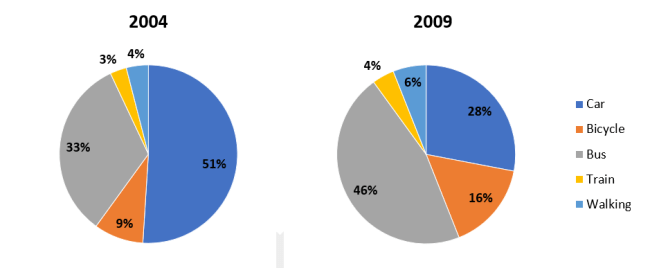
* car parking charges in the university 2006
** new bus stop in the university in 2008
Bài mẫu
The given pie charts compare the percentage of students using five different means of transportation (Car, Train, Bus, Bicycle, and Walking) to travel to a particular university during 2004 and 2009.
It is noticeable that travelling by train was the least favored form of transportation, while there was a change, from cars to buses, for the most commonly used form of transport over the five year period.
In 2004, just over half of students traveled to the university by car, with only a third taking a bus. The remaining students rode a bike, went on foot or took a train, with the figures being 9%, 4%, and 3% respectively.
However, with the construction of a new bus stop in 2008 and the introduction of car parking fees in 2006, in 2009 the number of students commuting by car dropped to 28%, and consequently the number of students travelling by all other methods increased. Those travelling by bus increased to 46%, bicycle user’s rose to 16%, and both train travelers and walkers increased by 1% and 2% respectively.
7.5. IELTS Writing Task 1 Pie Chart Sample #05
Đề bài
The pie charts indicate changes in the proportions of energy produced in a country from 1983 to 2003. Summarize the information by selecting and reporting the main features, and make comparisons where relevant.
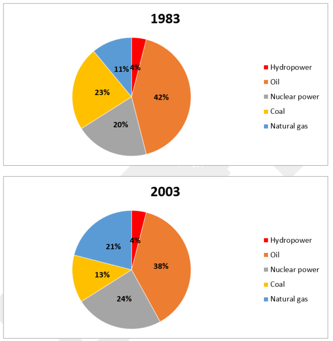
Bài mẫu
The given pie charts depict data regarding the percentage of energy generated from five different sources (Hydropower, Oil, Nuclear power, Coal, Natural Gas) in a particular country between 1983 and 2003.
In general, it is clear that oil was the most popular source of energy in both years despite a slight decrease. In addition, this country also relied more on using nuclear power and natural gas by 2003.
To begin with, in 1983, oil and coal were used to produce 42% and 23% of the total energy, respectively. Over the next 20 years, the proportion of energy produced from oil saw a slight decline by 4%, while energy from coal also reduced by 10%.
In contrast, there was a reverse pattern in both figures for nuclear power and natural gas, which increased by 4% and 10% respectively to collectively surpass the percentage of energy generated from coal. On the other hand, hydropower was responsible for only 4% of energy produced in both years.
7.6. IELTS Writing Task 1 Pie Chart Sample #06
Đề bài
The charts below show the proportion of people’s total spending in a particular European country was spent on different commodities and services in 1958 and in 2008.
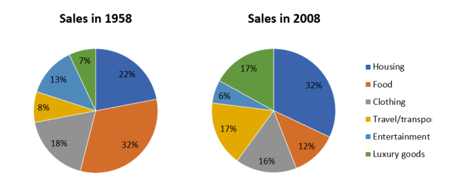
Bài mẫu
The pie charts detail the proportion of people’s total expenditure on six different goods and services (housing, clothing, entertainment, food, travel/transport, and luxury goods), in a European country, in 1958 and 2008.
It is clear from the charts that spending in all aspects, except clothing, changed quite substantially over the fifty year period.
In 1958, people spent the largest portion of their spending on food, at 32%. The two other categories that took up the majority of people’s money were housing, at 22%, and clothing at 18%. Entertainment, travel/transport and luxury goods only comprised around a quarter of all spending at 18%, 8% and &% respectively.
50 years later spending changed quite significantly with housing now becoming the biggest expense and taking up almost one third of total spending, at 32%. The expenditure on clothing, transport/travel and luxury goods all increased and all took up around 16-17% of the total spending. The expenditure on food dropped significantly to 12%, while entertainment costs were only half of that.
7.7. IELTS Writing Task 1 Pie Chart Sample #07
Đề bài
The charts below show the proportion of people’s total spending in a particular European country was spent on different commodities and services in 1958 and in 2008.
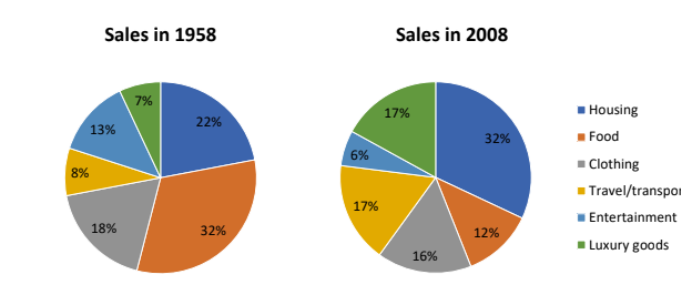
Bài mẫu
The pie charts detail the proportion of people’s total expenditure on six different goods and services (housing, clothing, entertainment, food, travel/transport, and luxury goods), in a European country, in 1958 and 2008.
It is clear from the charts that spending in all aspects, except clothing, changed quite
substantially over the fifty year period. In 1958, people spent the largest portion of their spending on food, at 32%. The two other categories that took up the majority of people’s money were housing, at 22%, and clothing at 18%. Entertainment, travel/transport and luxury goods only comprised around a quarter of all
spending at 18%, 8% and &% respectively.
50 years later spending changed quite significantly with housing now becoming the biggest expense and taking up almost one third of total spending, at 32%. The expenditure on clothing, transport/travel and luxury goods all increased and all took up around 16-17% of the total spending. The expenditure on food dropped significantly to 12%, while entertainment costs were only half of that.
7.8. IELTS Writing Task 1 Pie Chart Sample #08
Đề bài
The pie chart below shows information about where coffee is produced, consumed and where is profit goes. Summarise the information by selecting and reporting the main features, and make comparisons where relevant.
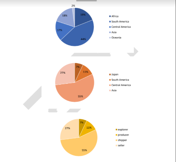
Bài mẫu
The pie charts show a breakdown of the production and consumption of coffee in particular regions, and how the profits are distributed. The initial impression from the charts is that whilst Central America is recorded to be the number one coffee producing region, it is Europe that consumed that highest amount of coffee.
Additionally, the majority of the profit earned from this industry goes to the shippers.
As far as coffee production is concerned, 44% of coffee is produced in South America, making it the leading supplier of coffee worldwide. This is followed by Africa (19%), Asia (18%) and Central America (17%).
Meanwhile, Oceania only constituted a modest 2% of the total coffee production. Regarding coffee consumption, Europeans appear to consume the most coffee, with the figure accounting for more than half. This is in marked contrast to the figures for North America and Japan at only around 10%. The remaining 27% belongs to other unspecified regions.
Profits made from the production, transport, and sale of coffee are not evenly shared among all those involved in the process. Shippers received as much as 55% of the profits, which is also the highest proportion of the profits. Sellers ranked second with 25%, while the remaining 20% is evenly divided between explorers and producers.
7.9. IELTS Writing Task 1 Pie Chart Sample #09
Đề bài
The charts below show the percentage of people aged 23-65 in different occupations in one UK town (Ashby) and in the UK as a whole in 2008.
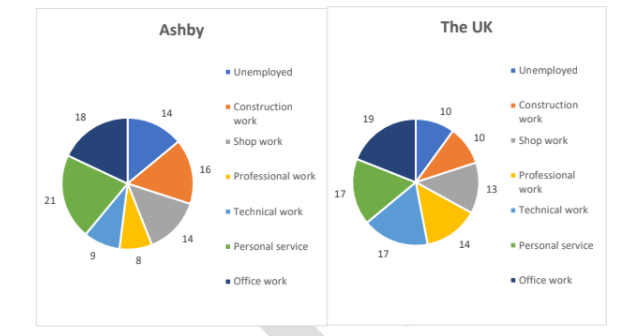
The pie charts illustrate the employment status of people aged 23 to 65, in Ashby and in the UK, in 2008.
Overall, the national unemployment rate was lower than the rate in Ashby. Moreover, while British people generally preferred office work, personal service was the most popular profession in Ashby.
The percentage of jobless people in Ashby was 14%, whereas that recorded in the whole nation was only 10%. The percentage of Ashby residents who were employed in office work and shop work were 18% and 14% respectively, similar to that of the whole of the UK, at 19% and 13% respectively.
In addition, the UK recorded a relatively high proportion of citizens employed in technical work, at 17%, while the figure for the same type of employment in Ashby was only about half that, at 9%. Furthermore, the percentage of construction workers and personal service providers in Ashby, at 16% and 21%, were both higher than the corresponding figures of the UK, at 10% and 17% respectively. Lastly, with regards to professional occupations, 8% of Ashby residents did this type of work, compared to 14% of the whole population.
7.10. IELTS Writing Task 1 Pie Chart Sample #10
Đề bài
The pie charts show the destination of export goods in three countries in 2010.
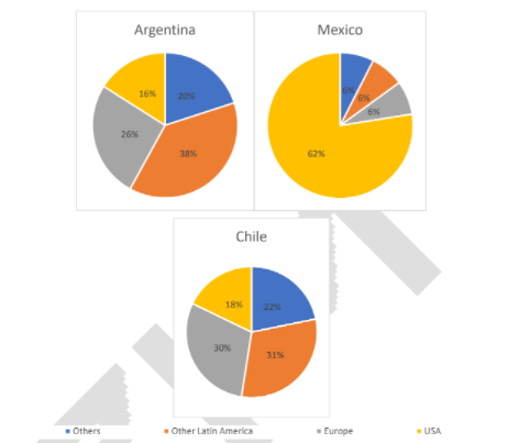
Bài mẫu
The given pie charts illustrate the percentage breakdown of goods exported from three South American countries, in 2010. It is clear that while Argentina and Chile’s exports were distributed more evenly amongst other nations, the large majority of Mexico’s exports were to the USA.
From the charts it can be seen that Argentina and Chile’s export trends were almost identical, with the majority of their exports going to other Latin American countries, at 38% for Argentina, and 31% for Chile. Meanwhile, 26% of Argentina’s exports went to Europe, 16% to the USA, and 20% to other countries. Similarly, Chile’s exports consisted of 30% to Europe, 18% to the USA, and 21% to other countries.
In contrast, the large majority of Mexico’s exports were to the USA, at 82%. The remaining exports from Mexico were to Europe, at 6%, other Latin American countries, at 6%, and other countries, also receiving 6%.
7.11. IELTS Writing Task 1 Pie Chart Sample #11
Đề bài
The three pie charts below show the changes in annual spending by a particular UK school in 1981, 1991 and 2001. Summarize the information by selecting and reporting the main features, and make comparisons where relevant.
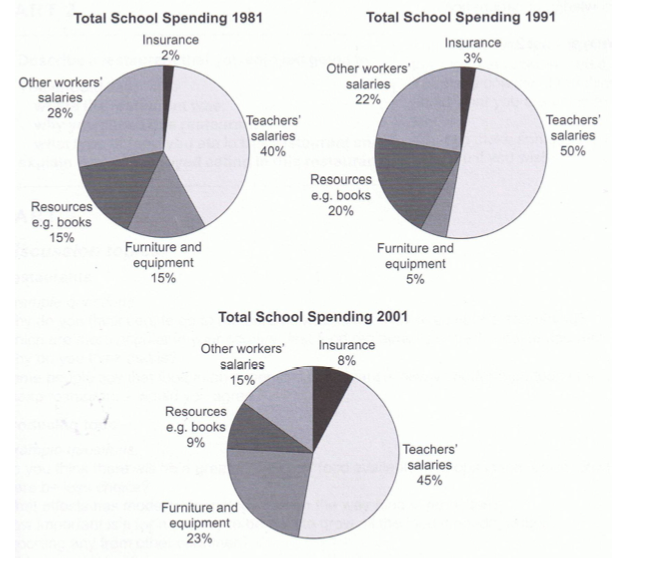
Bài mẫu
The pie charts compare the expenditure of a school in the UK in three different years over a 20-year period.
It is clear that teachers’ salaries made up the largest proportion of the school’s spending in all three years (1981, 1991 and 2001). By contrast, insurance was the smallest cost in each year.
In 1981, 40% of the school’s budget went on teachers’ salaries. This figure rose to 50% in 1991, but fell again by 5% in 2001. The proportion of spending on other workers’ wages fell steadily over the 20-year period, from 28% of the budget in 1981 to only 15% in 2001.
Expenditure on insurance stood at only 2% of the total in 1981, but reached 8% in 2001. Finally, the percentages for resources and furniture/equipment fluctuated. The figure for resources was highest in 1991, at 20%, and the proportion of spending on furniture and equipment reached its peak in 2001, at 23%.
7.12. IELTS Writing Task 1 Pie Chart Sample #12
Đề bài
You should spend about 20 minutes on this task. The pie charts show the main reasons for migration to and from the UK in 2007. Summarize the information by selecting and reporting the main features and make comparisons where relevant. Write at least 150 words.
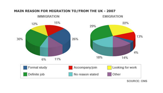
Bài mẫu
The pie charts illustrate the primary reasons that people came to and left the UK in 2007. At first glance it is clear that the main factor influencing this decision was employment.
Having a definite job accounted for 30 per cent of immigration to the UK, and this figure was very similar for emigration, at 29%. A large number of people, 22%, also emigrated because they were looking for a job, though the proportion of people entering the UK for this purpose was noticeably lower at less than a fifth.
Another major factor influencing a move to the UK was for formal study, with over a quarter of people immigrating for this reason. However, interestingly, only a small minority, 4%, left for this.
The proportions of those moving to join a family member were quite similar for immigration and emigration, at 15% and 13% respectively. Although a significant number of people (32%) gave ‘other’ reasons or did not give a reason why they emigrated, this accounted for only 17% with regards to immigration.
7.13. IELTS Writing Task 1 Pie Chart Sample #13
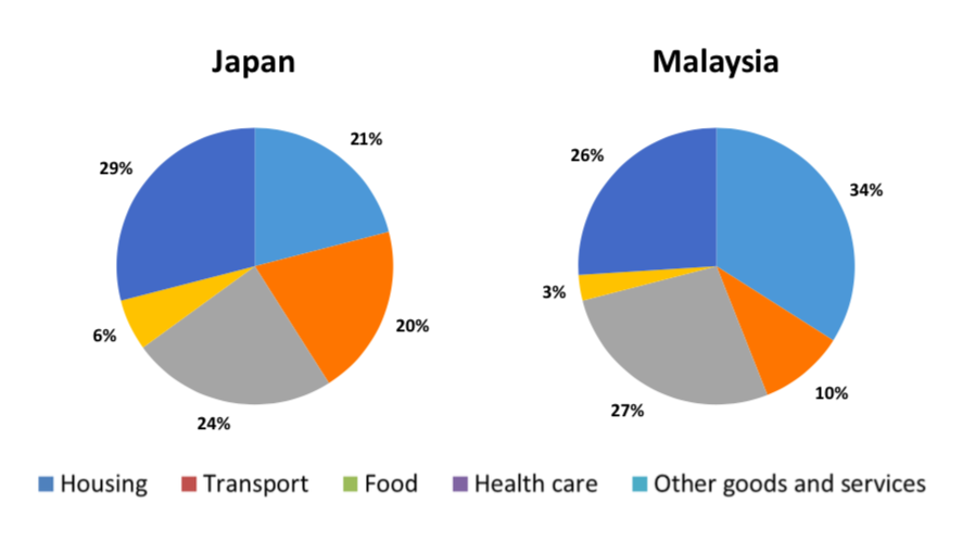
The charts illustrate the proportion of spending on different goods and services of households in two different countries in 2010.
Overall, it is clear that householders in both countries spent the largest proportion of their income on Housing and Hood, while Healthcare was the service receiving the lowest share of expenditure.
The proportion of spending on Housing was highest in Malaysia, at 34% while Japanese families allocated just 21% of their budget for this category. In terms of food, the figures for both nations were similar, at 24% and 27% for Malaysia and Japan respectively.
Regarding the remaining categories, Transport accounted for exactly a fifth of total expenditure in Japan, twice as much as the figure for Malaysia. Healthcare received the least amount of money in two countries while the percentage of money spent on Other goods and services were quite significant, at over a quarter in each country.
Cách viết pie chart đã dễ dàng hơn phần nào cho bạn sau bài chia sẻ ở trên của duhoctms.edu.vn rồi phải không? Duhoctms.edu.vn còn rất nhiều bài mẫu không chỉ của Writing Task 1 mà cả phần Writing Task 2 nữa đó. Chúc các bạn học tập tốt!
Xem thêm các bài viết khác:
- Tổng hợp 12 thì cơ bản trong tiếng Anh
- Phân biệt Some, Many, Much, Any, A Few, A Little, A Lot Of, Lots Of,…
- Mệnh đề quan hệ (Relative clause)
- Vị trí của giới từ trong mệnh đề quan hệ (RELATIVE CLAUSES)
- Causative Form – Thể nhờ vả
- Nắm chắc cấu trúc In order to/ So as trong vòng 5 phút
- Cách sử dụng that trong mệnh đề quan hệ
Bình luận